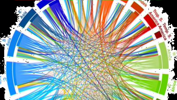
Where Each Part of the World Gets (and Sends) Its Food

Unless you’ve committed to a locavore lifestyle, keeping track of where your food comes from can get overwhelming fast. The ingredients that make up even the most basic meal have likely traveled thousands of miles to make it onto your plate. In order to illustrate just how interconnected our global food economy is, the International Center for Tropical Agriculture has collected a huge amount of data on where the world’s produce is sent, compiling the information in these eye-opening charts.
International Center for Tropical Agriculture
In the web above, the width of each thread shows the amount of calories flowing between each region. The threads match the color of the region they’re exported from, beginning close to their origins. The plot on the left only shows the most significant contributions (those in the 95 percentile) while the one on the right includes everything. The charts below provide the same information for the world's protein, fat, and overall weight of food.
International Center for Tropical Agriculture
International Center for Tropical Agriculture
International Center for Tropical Agriculture
The full study unpacks the interdependence of food supplies and production systems of more than 150 countries around the world. You can read the rest of it here before your next trip to the grocery store.
[h/t: Gizmodo]