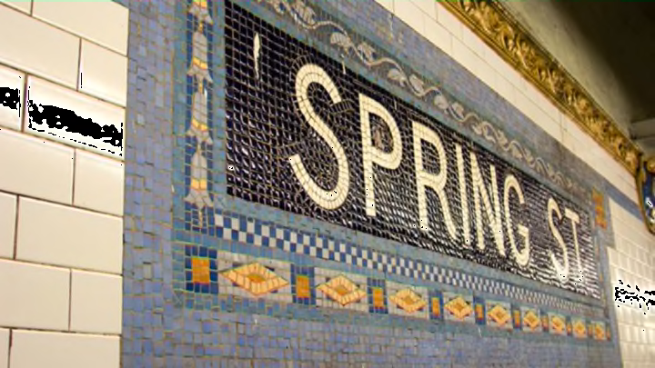
NYC Subway Tiles Are Color-Coded to Help Keep Riders on Track

At one point in New York City history, you could know when to transfer subways just by looking at the color of the tiles on the walls of the stations.
The modern New York subway system is run by the Metropolitan Transportation Authority (MTA), but before 1940, there were several competing subway companies: the Interborough Rapid Transit Company (IRT), the Brooklyn-Manhattan Transit Corporation (BMT), and the city-owned Independent Rapid Transit Railroad (IND). The designers behind the IND came up with a clever color system to help people find their way underground, as Gothamist reports.
On the lines now known as the MTA’s A, B, C, D, E, F, G, and Q, each station featured subway tiles in a different shade. The colors switched at express stations, so that people could look up and realize they needed to switch off the express line to the local train.
Here’s the color guide from the 1930s:
Image Credit: New York Transit Museum via nycsubway.org
For instance, on what is now Brooklyn’s G line, the Metropolitan Avenue-Grand Street station had "Nile Green" tiles surrounded by a black border, but once you get to Flushing Avenue two stops later, the tiles switched to "Light Green" surrounded by a "True Green" border, a color pattern that remained consistent for nine local stops in Brooklyn. (There’s a full list of station colors on nycsubway.org.)
If you were riding to Queens from Midtown Manhattan, you’d be able to tell that you had crossed the river when the stations switched from "Scarlet Red" to "Grape." It’s easier to visualize with a reference map:
Image Credit: Andrew Lynch via reddit
In 1979, the MTA standardized the subway system’s colors by assigning each subway a hue based on the avenue it runs along in Manhattan, which is why several lines share the same shade.
A lot has changed about navigating the New York subway since the ’30s (though most of the technology running the system hasn’t been updated since then), but you can still try to find your way based on this vintage color-coding. It's sure to come in handy at some point when the digital displays break and the conductor's announcements become unintelligible.
[h/t Gothamist]