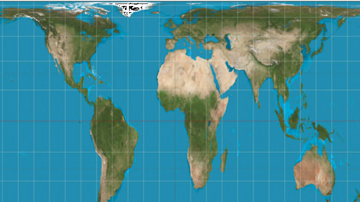
Boston Public Schools Are Adopting a More Accurate World Map

Walk into any classroom in America and there’s one world map you’re likely to see. Since the 16th century, the Mercator projection has been the standard map used by educators to illustrate the layout of the Earth. But now, schools in Boston are moving to phase out the 500-year-old design in favor of something more accurate.
As The Guardian reports, the Boston public school district began transitioning the Peters projection into schools in March. The Peters map places countries and continents in the same positions as its more pervasive predecessor, but the two visions of the world differ in scale.
Mercator Projection. Image credit: Wikimedia Commons // CC BY-SA 3.0
German filmmaker and journalist Arno Peters was one of the first notable figures to rail against the Mercator map. He claimed that it provides an inaccurate and Eurocentric view of the globe. The Northern Hemisphere is distorted to look larger, giving the false impression, for example, that Greenland and Africa are roughly the same size (while in reality, Greenland could fit inside Africa 14 times). In 1973, Peters released a map that compressed the upper half to depict the area of all the Earth’s continents more fairly.
The update to Boston’s 125 public schools won’t be immediate: The old maps will be left up for now, but any new ones that are ordered must be Peters. Classrooms that have received the improved projections are hanging them up beside the Mercator map to let students compare.
The Boston school district’s director of history and social studies Natacha Scott told The Guardian, “Some of their reactions were quite funny, but it was also amazingly interesting to see them questioning what they thought they knew."
[h/t The Guardian]