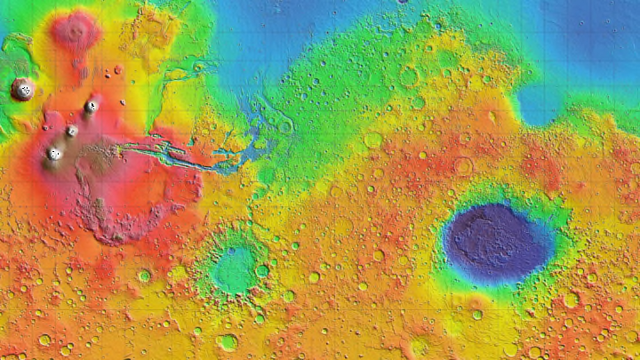
When designers want to visualize changes in data, like in a heat map or a topographical survey, they often reach for the rainbow. The rainbow color scale is almost the default for visualizing scientific and engineering data. And yet, putting all the colors of the rainbow into a single image isn’t a good idea. For one thing, as Scientific American reports, it makes visualizations impossible to read if you’re colorblind. And even if you can pick out every color in the image, that doesn’t mean you understand what going from red to violet means.
Now, researchers from the U.S. Department of Energy’s Pacific Northwest National Laboratory in Washington have developed an alternative to the rainbow color scale that will make data visualization and other images easier to decipher for people with color-vision deficiency and the general public. Using a mathematical model of how the brain perceives differences in color, they created a new color scale they call cividis, which shows data exclusively in shades of blue and yellow—the colors that someone with colorblindness would see while looking at a rainbow color scale.

They took traditional rainbow color maps and ran them through software that converted them to look closer to the blue-yellow scale that reflects what someone with the most common form of colorblindness sees. Then, the software adjusted the color and brightness of that image to look more consistent with how people interpret data. One of the problems with the rainbow scale is that people automatically see the brightest color as a peak, sometimes leading them to incorrect conclusions. Even though yellow is one of the middle colors in Roy G. Biv, it often jumps out at people as the most extreme color on the map, though red is the highest on the scale. In this color scale, the color does get brighter as the values go up, so you don't have to work as hard to interpret it.
In general, most people don’t intuitively know what order the colors of the rainbow should appear in at all. Red and violet are at opposite ends of the Roy G. Biv scale, but that’s not visually apparent. Narrowing the range down to two colors makes it easier for readers to pinpoint where on the scale a specific point is.
The two-color scale also makes changes in data look more gradual, whereas with a rainbow of colors, the difference between each color looks very stark. The ability to show a gradual progression can reflect more nuance.
It’s not just a matter of aesthetics. An eye-catching, complex rainbow visualization can lead scientists to misinterpret their own data, while an easier-to-read scale makes it easier for them to pick out patterns. In one 2011 study cited by Scientific American [PDF], scientists at Harvard found that doctors were faster and better at spotting signs of heart disease while looking at 2D images of arteries on a color scale that just used black and red than while looking at a 3D rainbow visualization.
Cividis has already been added to the color-scale libraries of some image-processing software, and its creators hope to convince more scientists and designers to use it in the future.
[h/t Scientific American]
