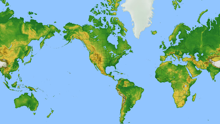
Look at any map pinned to a classroom wall, and you’ll notice that Greenland seems particularly large. It’s true that the landmass isn’t exactly small, but its true size is nowhere near that of the whole African continent. As it turns out, the map we’ve long relied on to depict the world isn’t actually the most accurate visual.
The Problem With the Mercator Projection
In 1973, Arno Peters, a German filmmaker and journalist, called a press conference to denounce the widely accepted map of the world known as the “Mercator Map.”
Peters’s position was that the Mercator Projection—a cylindrical projection first developed in 1569 by Flemish cartographer Gerardus Mercator—was not only inaccurate, but also racist. Peters pointed out that the Mercator map has a distortion in the northern hemisphere, making North American and Eurasian countries appear much larger than they actually are.
Greenland and Africa are shown as roughly the same size, although in reality, the latter landmass is about 14 times larger. In contrast, the regions along the equator—Africa, India, and South America, to name a few—appear smaller, especially when seen next to the distorted northern half of the map. It was Peters’s belief that this error led many in the developed world to ignore the struggles of the larger, poorer nations near the equator.
Of course, Peters had a suggestion on how to fix this problem: his own map. The Peters Projection map claimed to show the world in a more accurate, equal-area fashion.
A More Accurate Map
Because Peters’s map showed the size of developing nations more accurately, charitable organizations that worked in those regions quickly gave him their endorsement. Eventually, his map became so well-received that some were calling for an all-out ban on the Mercator map, believing it to be an outmoded symbol of colonialism.

Cartographers agreed that the Mercator map was outdated, inaccurate, and wasn’t the best way to represent the world’s landmasses. They’d been calling for the use of a new projection since the 1940s.
One of the reasons experts wanted to move away from the Mercator was because of the distortion. However, they also understood that it was distorted for good reason. The Mercator map was intended as a navigational tool for European mariners, who could draw a straight line from Point A to Point B and find their bearings with little trouble. Because it was made for European navigators, it was actually helpful to show Europe larger than it really was. It wasn’t a political statement—it was instead a decision made purely for ease-of-use.
However, the biggest insult to cartographers was the Peters projection itself. It was essentially the same map devised in 1855 by a cartographer named James Gall. Many have recognized this similarity, and now you’ll often see Peters’s map called “The Gall-Peters Projection.”
Read More About Maps:
