%20%20--%3E%0A%3Csvg%20version%3D%221.1%22%20id%3D%22Layer_1%22%20xmlns%3D%22http%3A%2F%2Fwww.w3.org%2F2000%2Fsvg%22%20xmlns%3Axlink%3D%22http%3A%2F%2Fwww.w3.org%2F1999%2Fxlink%22%20x%3D%220px%22%20y%3D%220px%22%0A%09%20viewBox%3D%220%200%20684.6%2068.1%22%20style%3D%22enable-background%3Anew%200%200%20684.6%2068.1%3B%22%20xml%3Aspace%3D%22preserve%22%3E%0A%3Cg%3E%0A%09%3Cpath%20d%3D%22M444.1%2C29.3h-17.4v14.5h17.4V29.3z%20M36.4%2C68.1l29.3-50.8V0H50.4L32.9%2C36.8L15.5%2C0H0v68.1h16.7V45.8l12.4%2C22.3H36.4z%0A%09%09%20M49.1%2C68.1h16.6V23.4L49.1%2C52.1V68.1z%20M76.6%2C68.1h45V53.8H93.3V41.6h21V27.1h-21V14.8h28.3V0.1h-45V68.1z%20M175.6%2C68.1h17.3v-68%0A%09%09h-16.5v40.3L150%2C0.1h-17.6v68h16.7V27.7L175.6%2C68.1z%20M235.8%2C14.8h15.4V0.1h-47.4v14.7H219v53.2h16.8V14.8z%20M290.3%2C45.9h-17.1%0A%09%09l7.5-15.6h2L290.3%2C45.9z%20M298.7%2C68.1h18l-32.2-68h-5.7l-32%2C68h18l3.3-7.1h27.1L298.7%2C68.1z%20M325.2%2C68.1h46.2V53.8h-29.6V0.1h-16.7%0A%09%09V68.1z%20M423.7%2C14.8h27.2V0.1H407v68h16.7V14.8z%20M462%2C68.1h46.2V53.8h-29.6V0.1H462V68.1z%20M564.8%2C34.1c0%2C10.7-7.2%2C19.2-18.5%2C19.2%0A%09%09c-11.4%2C0-18.5-8.5-18.5-19.2s7.1-19.2%2C18.5-19.2C557.6%2C14.9%2C564.8%2C23.4%2C564.8%2C34.1%20M580.6%2C34.1c0-19-14.2-34-34.3-34%0A%09%09c-20.2%2C0-34.3%2C15-34.3%2C34c0%2C19%2C14.1%2C34%2C34.3%2C34C566.4%2C68.1%2C580.6%2C53.1%2C580.6%2C34.1%20M604.8%2C20.5c0-4.1%2C3.3-6.2%2C6.7-6.2%0A%09%09c4.4%2C0%2C6.6%2C3%2C6.6%2C6.6h14.7C631.8%2C9.1%2C625.1%2C0.1%2C611%2C0.1c-12%2C0-21.7%2C9.3-21.7%2C20.6c0%2C10.9%2C5.9%2C15.9%2C16.7%2C19.8%0A%09%09c5.2%2C1.8%2C11.5%2C3.2%2C11.5%2C8c0%2C3.3-2.4%2C5.5-6.4%2C5.5c-3.6%2C0-6.6-3-6.6-6.7h-15.2c0%2C11.5%2C7.9%2C20.8%2C21.8%2C20.8c12%2C0%2C21.6-9.3%2C21.6-20.6%0A%09%09c0-10-5.3-16.4-16.7-19.8C610.6%2C26.1%2C604.8%2C25.3%2C604.8%2C20.5%20M670%2C20.9h14.7C683.8%2C9.1%2C677.1%2C0.1%2C663%2C0.1c-12%2C0-21.7%2C9.3-21.7%2C20.6%0A%09%09c0%2C10.9%2C5.9%2C15.9%2C16.7%2C19.8c5.2%2C1.8%2C11.5%2C3.2%2C11.5%2C8c0%2C3.3-2.4%2C5.5-6.4%2C5.5c-3.6%2C0-6.6-3-6.6-6.7h-15.2c0%2C11.5%2C7.9%2C20.8%2C21.8%2C20.8%0A%09%09c12%2C0%2C21.6-9.3%2C21.6-20.6c0-10-5.3-16.4-16.7-19.8c-5.4-1.6-11.3-2.4-11.3-7.2c0-4.1%2C3.3-6.2%2C6.7-6.2C667.7%2C14.4%2C670%2C17.3%2C670%2C20.9%0A%09%09%22%2F%3E%0A%3C%2Fg%3E%0A%3C%2Fsvg%3E%0A)

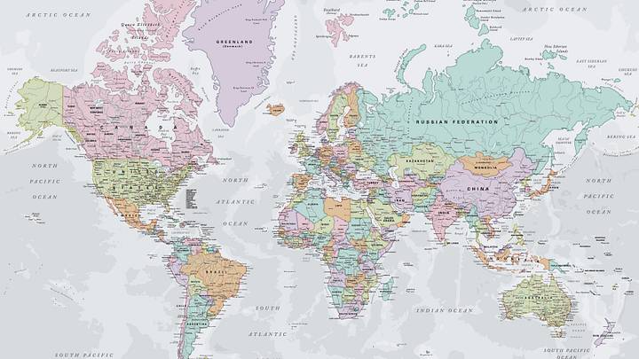
The map you might have been learning from your whole life may have given you a pretty inaccurate understanding of the relative sizes of Earth's landmasses.
On September 4, 2026, the United Nations General Assembly voted overwhelmingly in favor of a resolution aimed at correcting some long-standing distortions on the most common world maps. The resolution, called “Correct the Map,” is not legally binding, but it encourages countries to use a 2018 map called the Equal Earth projection—or other maps that accurately account for the relative size of Earth's landmasses—instead of the traditional Mercator map.
The Mercator projection was created by Flemish cartographer Gerardus Mercator in 1569. It was developed primarily for navigation, and it serves this purpose well, preserving angles and direction and allowing navigators who relied on compasses to successfully chart their routes. However, it does not accurately depict the size and scale of the world’s landmasses. Despite this, it has been a staple of maps across the world for centuries, and remains the most commonly used projection.
“If you're using the Mercator map as a world map, say, in the classroom, students would just have a completely warped view of the size of countries in the world,” said cartographer Tom Patterson, a co-creator of the Equal Earth projection, per NPR.
The “Correct the Map” resolution was introduced by the West African nation of Togo. “Maps shape our understanding of the world. They guide education, nourish the imagination, and influence collective perceptions,” Togo’s Foreign Minister Robert Dussey said before the vote. “It's time for us in Africa to take responsibility to change what we can change ourselves.” 164 member states voted in favor of the resolution. Six abstained, and the United States was the only nation to vote against the resolution.
Here are five ways the modern Mercator projection may have warped your geographical worldview.
- Africa is not the same size as Greenland
- Areas near the poles are not that big
- Europe is not the same size as South America
- Alaska is not larger than Mexico
- Europe is not in the center of the globe
Africa is not the same size as Greenland

The most obvious difference between the Mercator projection and the Equal Earth projection is Africa’s size relative to the landmasses around it. In the Mercator projection, Africa appears to be about the same size as Greenland. It also appears somewhat similar in size to South America, and is seemingly dwarfed by Russia.
In reality, Africa has a surface area of 11.7 million square miles compared to Greenland’s 836,330 square miles, making Africa about 14 times the size of Greenland. Russia, meanwhile, has a surface area of approximately 6.6 million square miles, making Africa roughly 1.77 times the size of Russia.
Areas near the poles are not that big

The reason why the Mercator projection makes Greenland look so large and Africa so small relative to their actual sizes is rooted in one major issue: the Mercator projection stretches Earth’s polar regions and the landmasses near them, while condensing countries closer to the Equator.
In some common renderings of the Mercator projection, Antarctica looks particularly huge. In certain projections, it appears to be larger than the entire Eurasian landmass, and often looks at least quadruple the size of Australia. In actuality, Antarctica is about 5.5 million square miles in size. This is actually less than twice the size of Australia—which has a land area of 2.9 million square miles—and less than half the size of Africa.
The reason the polar regions look so distended on the Mercator projection has to do with the map’s original purpose: navigation. Mercator “wanted a straight line to be drawn on a map to look like a straight line in reality if you followed a compass bearing,” University College London cartography professor James Cheshire told the BBC. “That was what it was intended to do, and that's what it does brilliantly well.”
To account for the planet’s curvature, Mercator's projection increases in scale as it moves away from the equator. This allowed the map to serve its navigational purposes exquisitely—but has also inadvertently been altering many people’s sense of the size and scale of the world’s continents for centuries.
Europe is not the same size as South America

In the Mercator projection, South America often looks roughly the same size as Europe. Yet in reality, South America has a surface area of around 6.9 million square miles, while Europe’s surface area is roughly 3.8 million square miles, making South America around 1.8 times larger than Europe.
Alaska is not larger than Mexico

The Mercator projection also distorts the size of Canada, particularly its northernmost portion, and Alaska along with it. On this map, Alaska appears to be at least three times the size of Mexico. Yet in truth, Alaska covers 665,384 square miles in total. Mexico, meanwhile, is substantially larger no matter how you swing it, with a surface area of 761,610 square miles.
Europe is not in the center of the globe

In the most common modern rendition of the Mercator projection, Europe appears roughly at the center of the map, with the equator located somewhere in the bottom third of the rectangle. In actuality, of course, there is no center of the world, since our planet is spherical.
The Equator runs through central Africa and northern South America and marks the split between the Northern and Southern Hemispheres. On the Equal Earth projection, the equator runs horizontally through the center of the map, and Europe is located toward the top.
Over the years, two-dimensional maps have depicted our planet’s geography from a wide variety of angles. There are south-up maps that flip the traditional layout upside down and depict Antarctica in the northern edge of the planet and Russia and Canada on the bottom. There are also maps that place the Pacific Ocean in the center, with Africa to the left and the Americas to the right. Ultimately, though, no two-dimensional map will ever depict the Earth’s layout with total accuracy. Fortunately, we do have a handy contraption that can do the job just fine: the globe.