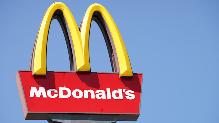
If you thought the McDonald’s logo was an abstract rendering of two massive, bendy French fries dipped into a pool of sweet, tangy ketchup, it's not a bad guess—but the logo colors actually have specific psychological reasons behind them, according to Reader’s Digest.
The website explains that the color red is stimulating and associated with activity. Indeed, some studies show that seeing the color red encourages us to take action more quickly and more forcefully than other colors do. In a study from the University of Rochester, students were instructed to read aloud their participant number, which was written in either red or gray crayon, and then pinch and hold open a metal clasp. A second group of participants had to squeeze a handgrip as hard as possible when the word squeeze appeared on the screen against a red, blue, or gray background. In both experiments, participants pinched or squeezed with more force when the color red was involved, and students in the handgrip experiment even had faster reaction times when squeeze was on a red background. In other words, you might be more inclined to veer off onto an unexpected exit for an impulse Big Mac when you see the red McDonald’s logo on the highway.
We associate yellow, on the other hand, with happiness, according to Reader's Digest. It’s also reportedly the most visible color in daylight, which helps it show up against other less psychologically optimized fast food road signs. Since your brain processes color before words or shapes, it’s already sending you signals to indulge in greasy goodness upon seeing the McDonald’s logo before you can even register any other information.
McDonald’s has been willing to compromise on its classic color scheme in the past. In 2009, the burger chain made a major push in Europe to replace its red background with a green one, hoping people would perceive it as a more environmentally friendly corporation. That particular public relations venture never made it to this side of the pond, but if you travel to Sedona, Arizona, you will spot some teal (rather than golden) arches.
Read More About McDonald’s:
This story originally ran in 2019; it has been updated for 2025.
