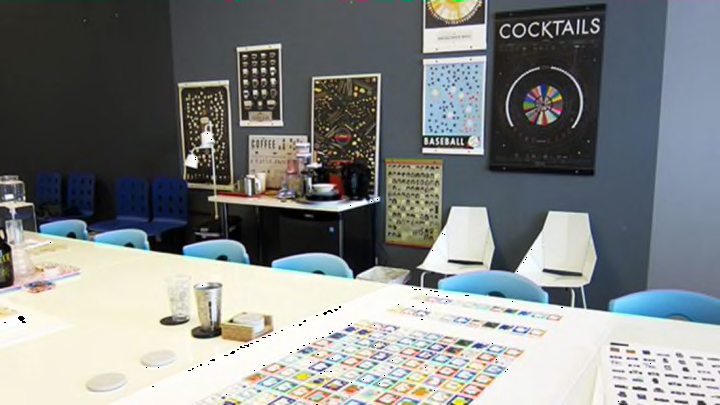
Behind the Scenes at Pop Chart Lab

Every week at Pop Chart Lab's downtown Brooklyn office, the staff of 14 —up from just two founders in 2010— sits down for an editorial meeting, where they discuss the next three months of production. And since they try to release a new product every week, there are usually 12 different projects to talk about. If you've seen their stuff, you know these range from beer maps to dog diagrams to cheese charts.
“It’s a combination of stuff that people are interested in and stuff that has a lot of data,” Co-Founder and Editorial Director Patrick Mulligan says of picking new topics to tackle. For the Visual Compendium of Baseball Uniforms, released today, the inspiration came from an earlier hit.
"We did basketball jerseys in May, and it was really successful—one of our most successful releases of the spring," says Marketing Director Rachel Mansfield. And although they already have several different baseball-themed posters in their catalog, it seemed like a natural fit.
Typically, the team tries to establish a format—will it be a visual compendium, a taxonomy, or a map?—along with the topic. But sometimes, figuring out how to present the data is the tricky part. "We’d been trying to do a cocktail chart for a long time and couldn’t figure out a way to do it," Mulligan says. "We had the problem where there are some ingredients that are in everything and some ingredients that are only in some things." Eventually, the team realized that at least in that sense, cocktails are like candy bars, for which they had already designed a poster based around different types of chocolate in the center. "Once we did that we were like, wait a minute, this will work for cocktails. So now it’s become a house style of a chart," Mulligan says. (Meatballs almost got the same treatment but that one never panned out.)
The baseball uniforms chart, like its basketball inspiration, wouldn't be quite so difficult. With the format established, the team dove into research, scouring databases and compiling old photographs, looking for anything iconic or especially weird. For basketball, the chart had included a handful of jerseys worn by fictional teams, but when it came to baseball, they found such an abundance in the Majors, Minors, Independent, and Negro Leagues that they had more than enough historical options to choose from.
Once the list was sufficiently whittled down—121 uniforms in total, dating from 1869 to the current season—illustrators took over. Although colors in the actual jerseys may differ in shade and tonality, for the sake of aesthetic continuity, the team establishes a palate of standardized colors—a single dark red, grey, yellow, etc.
While working on the layout of the poster, the team was inspired by sheets of old baseball cards and went through several different iterations to make their depictions more stylistically similar. It was during this process that pants were added.
Even the title script got a dose of inspiration from baseball memorabilia; it was redrawn based on a vintage game ticket.
With everything laid out in proper homage to America's pastime, the poster looks just about finished, and if you click on over to the site today, you can pre-oder it.
But there's a chance that if you do, the version you receive will be ever so slightly different—for the better. Each Pop Chart Lab poster is released a week before the first batch gets printed, and in that time, fine media organizations such as mental_floss write about it, and fine readers such as yourselves might be inclined to comment if they spot a glaring error or oversight. Pop Chart Lab appreciates their active fan base and so they actively seek out these critiques—and if something seems valid, they'll make a change to reflect that.
For instance, you can't tell now, but when the Fantastical Fictive Beers poster was first released, fans spotted one major omission: Schraderbräu, from Breaking Bad. Enough people clamored for it to be included that the PCL team went back in and added it—and even gave the commenters their due. "We like to tell them, 'Thanks for the feedback, we updated it,'" Mansfield says.
Of course, it's probably not worth it to comment on every missing uniform from the past several centuries of baseball, so unless there's a spelling error, the team can probably wrap the design stage of the Visual Compendium of Baseball Uniforms. But that just means it's on to the next thing for the folks at Pop Chart Lab. Broadway fans in particular should keep an eye out for an upcoming poster and, a personal triumph for the team, there will soon be a wine taxonomy to match their Very, Very Many Varieties of Beer.
"People have done versions of a taxonomy like our beer one with wine, but they do it based on taste, which is sketchy because it’s not quantifiable in any way," Mulligan says of this particularly arduous undertaking. "We found a way to do it based on genetics instead."
He bought a big old book full of wine genetics, and at press time, the information was being distilled into a sprawling chart of grape-colored bubbles.
Hannah Keyser
All photos courtesy of Pop Chart Lab unless otherwise noted.