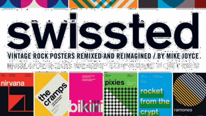
On the surface, it might not seem like punk rock and Swiss modernism have much in common—but pick up Mike Joyce's book Swissted, out tomorrow, and you'll see that the music and art movements blend beautifully. "I always liked that my two favorite things seemed completely at odds with one another," Joyce tells mental_floss. "Punk has an anti-establishment ethos and Swiss modernism is very structured. But at the same time there’s a common thread between the two—the Swiss modernists purged extraneous decoration to create clear communication, while punk rock took on self-indulgent rock and roll and stripped it to its core. So I thought it would be an interesting study to combine the two and see what happened."

Joyce, who owns the New York City-based Stereotype Design, grew up listening to punk and went to hardcore and indie rock shows in the mid-to-late '80s. "I was always really inspired by the aesthetic of underground music and designed t-shirts, flyers, and cassette demos for my friends who were in local bands at the time," he says. In the early 1990s, Joyce attended Alfred University's School of Art and Design and studied graphic design under Fred Troller, a Swiss-born graphic designer who introduced the student to International Typographic Style, which originated in Switzerland in the 1950s and emphasized cleanliness and readability. "To me, it was completely new and fresh," Joyce says. "I loved how completely different it was than anything I'd ever seen up to that point."

Swissted features 200 redesigned posters from shows that actually happened, featuring bands like the Ramones, the Dead Kennedys, Weezer, Black Flag, and more—all ready to be ripped out and hung on the wall. Joyce turned to the internet to find his source material: the original gig posters. "Some of the original poster and flyer artists have posted their work on various sites and blogs and there are a lot of collectors with an impressive amount of old school work displayed," he says. "There’s also a brilliant book, F***ed Up + Photocopied, that served as a great source of inspiration."

Flyers have long served as an artistic inspiration for Joyce. "In just one random collection of flyers you can find minimalism, collage, transformative art, beautiful typography, black humor, unique handwriting and lettering, abstraction, political statements—the list goes on," he says. "So that basic spirit and aesthetic has always been a big inspiration to all of my design work." That said, his goal with Swissted was to do something completely different than the original posters—reimagining them into a cohesive collection—while including all of the information from the posters.

To design the posters, Joyce looked at the work of Swiss poster designers like Armin Hofmann, Emil Ruder, and Josef Muller-Brockmann. "If you look at Muller-Brockmann’s 'Musica Viva' poster series, there’s not a musical instrument or musician to be seen" Joyce says. "He used shape, structure, motion, color, and typography to evoke the feeling of music. And while doing this, they also somehow achieve perfectly clear communication through abstraction, which to me is brilliant. It’s kind of the opposite of how things are done today where everything needs to be so literal and hit you over the head."
And the font each poster features is not Helvetica—it's lowercase berthold akzidenz-grotesk medium.

One of Joyce's favorite designs is the 45 Grave poster. "I really wanted to focus on how beautiful and eye-catching a portion of the band’s name could be and what interesting aesthetic things would happen if the numbers intersected and combined with each other," he says.

In his interpretations of the Sex Pistols and Red Hot Chili Peppers posters, the artist "wanted to create a sense of tension and motion."

A few of the posters, however, do have a slightly literal interpretation. "The Fang design has a wink to the band’s name in that the white triangle can be seen as one menacing fang," Joyce says. "It’s been really fun for me to hear people guess at the meaning behind certain designs or for them to come up with their own interpretations. It kind of reminds of what a lot of songwriters say about fans re-interpreting their lyrics. After a while, the song belongs to everyone and not just the songwriter."
The project, Joyce says, plays with the idea that "a lot of punk rock album art didn’t fit within people’s pre-conceived ideas of what the genre should look like. Album covers by the likes of the Adolescents, Germs, Gang of Four, the Buzzcocks, and Public Image Limited used minimal or bold typography to create memorable and lasting cover art which was at odds with what people perceived to be 'punk.' I think Swissted is a tribute to the true independent spirit of punk in that it shows there’s not one specific way in which things should be done."
