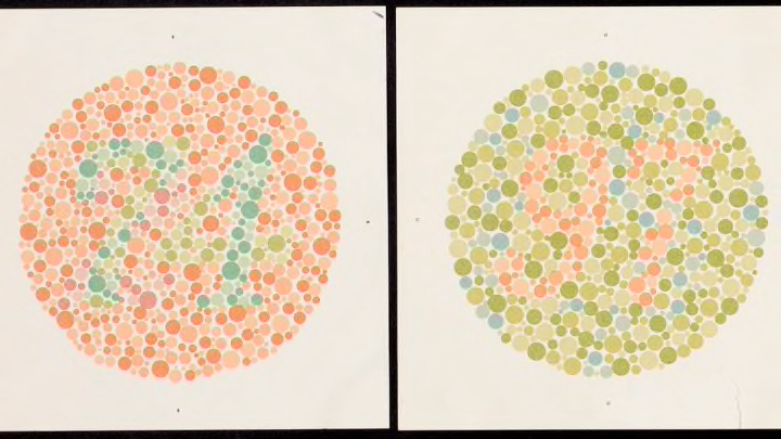
You may have seen them at your ophthalmologist's office: large circular diagrams made up of colored dots. People with normal vision are able to discern a number among the dots of contrasting colors. People who are color blind might see only a field of spots.
These elegant, deceptively modern drawings were published 100 years ago by a Japanese ophthalmologist, Shinobu Ishihara. Thanks to the designs' simplicity and diagnostic accuracy, the Ishihara test is still the most popular and efficient way to identify patients with color vision deficiencies.
Born in Tokyo in 1879, Ishihara studied medicine at the prestigious Tokyo Imperial University on a military scholarship, which required him to serve in the armed forces. After graduating in 1905, he worked for three years as a physician specializing in surgery in the Imperial Japanese Army, and then returned to the university for postgraduate studies in ophthalmology. In his research, Ishihara focused on identifying and recruiting soldiers with superior vision, thereby increasing the overall effectiveness of the military. And that became of prime importance to Japan beginning in 1914.
As World War I spread across Europe, Asia, and the Pacific, the Japanese army asked Ishihara to develop a better way to screen draftees for color vision problems. The most popular method at the time was the Stilling test, invented by German ophthalmologist Jakob Stilling in 1878 as the first clinical color vision test. (Previous tools had asked patients to identify the colors of wool skeins or illuminated lanterns—useful skills for sailors and railway conductors, but an imprecise method for diagnosing vision issues.)
"Though popular, 'the Stilling' retained a distinctly 19th-century flavor, more treatise-like and less diagnostically incisive," according to Eye magazine.

Japanese army officials requested a new diagnostic tool that was easier to administer and interpret. The test Ishihara began to develop was based, like Stilling's, on the principle of pseudo-isochromatism—a phenomenon in which two or more colors are seen as the same (or isochromatic) when they're actually different. A person with normal vision could easily see the difference, while people with red-green deficiency, the most common form of color blindness, would have difficulty distinguishing those two opposing colors. Those with blue-yellow color blindness, a less common type, would have a hard time discerning reds, greens, blues, or yellows.
Ishihara hand-painted circular designs comprised of small dots of different areas and colors so that variations in the design could be discerned only by color and not shape, size, or pattern. Hidden in the field of dots was a figure of a contrasting color that people with normal vision could see, while those with deficiencies could not. Other plates in the series were designed to show figures that would be visible only to people with deficiencies. When physicians displayed the diagrams, patients said or traced the visible figure within the circle without needing to use ambiguous color names, which standardized the possible results.
The earliest sets of Ishihara plates, produced in 1916, were reserved exclusively for the army's use and featured Japanese characters within the diagrams. In 1917, in an effort to sell the series internationally, Ishihara redesigned it with the now-familiar Arabic numerals and published a set of 16 plates as Tests for Colour Deficiency.

The tests were adopted throughout the world beginning in the early 1920s, and eventually grew into a set of 38 plates. But their popularity almost led to their undoing. Unauthorized publishers printed their own version of the plates to meet demand, throwing the accuracy of the diagnostic colors into doubt. "The plates have been duplicated along with an easily memorized key by cheap color processes in the tabloid press, and exposed in public places, reducing the fifth edition [of the collection] to a parlor game," one psychologist warned in the Journal of the Optical Society of America in 1943.
Despite those obstacles, the tests proved indispensable for both practicing physicians and researchers. Ishihara continued to refine the designs and improve the color accuracy of the images into the late 1950s, while he also served as the chair of the ophthalmology department and then dean of the medical school at Tokyo Imperial University. In addition to Tests for Colour Deficiency, he also published an atlas, textbook, lectures, and research studies on eye diseases. But he is remembered most for the iconic charts that seamlessly blend art and science.
