The production logos that cap off a TV show don't just tell you who made the show—they're also a glimpse into the creator’s sense of humor and personality. Here are the stories behind a few logos you might recognize.
1. Bad Robot Productions
Before J.J. Abrams was hired to direct Star Wars: Episode VII for Disney and Lucasfilm, he was the mastermind behind hit genre TV series such as Alias, Lost, and Fringe. At the end of each episode, the logo for Abrams’ production company, Bad Robot Productions, popped up on the screen.
While Abrams founded Bad Robot in 1998, the iconic production logo didn’t emerge until 2001. Some fans believe Bad Robot is a reference to Brad Bird’s animated film The Iron Giant, but the idea for the logo came to J.J. Abrams during a writers’ meeting on Alias.
He recorded his children Henry and Gracie saying the words and put it all together with his laptop. ''That day in the office while editing,'' says Abrams, ''I put together sound effects on my computer, burned a QuickTime movie on a CD, gave it to postproduction, and three days later it was on national television.''
2. Mutant Enemy Productions
Joss Whedon founded Mutant Enemy Productions in 1996 to produce the Buffy the Vampire Slayer television series. Mutant Enemy is a reference to the song “And You and I” from the progressive rock band Yes, of which Whedon is an avid fan. “Mutant Enemy” is also what Joss Whedon calls his typewriter. He drew and voiced the production logo, which has been referenced from time to time on Buffy the Vampire Slayer.
3. Ubu Productions
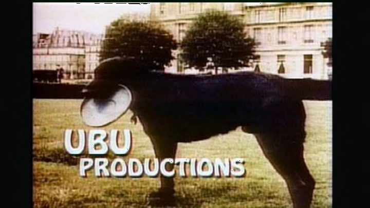
In the '80s, no episode of Family Ties was complete until you heard the words, “Sit, Ubu, Sit. Good dog,” followed by a dog’s single bark. Ubu Productions was the late Gary David Goldberg's company. Along with Family Ties, Goldberg produced Brooklyn Bridge and Spin City.
The production company’s mascot was Ubu Roi, black Labrador Retriever, who was named after playwright Alfred Jarry’s 1896 stage play Ubu Roi. Goldberg owned Ubu in college; he and his wife, Diana, traveled the world with the dog. The photo of Ubu Roi in the logo was taken in the Tuileries Garden close to the Louvre Museum in Paris, France. Ubu died in 1984.
4. Steven Bochco Productions
Television producer Steven Bochco was responsible for iconic TV series such as Hill Street Blues, L.A. Law, Doogie Howser, M.D., and NYPD Blue. His company's logo pays homage to his father, Rudolph Bochco, a Russian immigrant and concert violinist. The music featured is the 3rd movement of Vivaldi's “Summer (Presto)” from The Four Seasons—one of Bochco's father’s favorite pieces of music.
5. Stephen J. Cannell Productions
TV shows from Stephen J. Cannell Productions included The Rockford Files, The A-Team, and 21 Jump Street. The company's logo was known as “Guy on Typewriter” and showed Cannell smoking a pipe while intensely typing and flinging a sheet of paper after he was finished. The floating paper quickly transitioned into a stack of papers in the animated Stephen J. Cannell Productions logo. The logo was changed often to show Cannell in his office surrounded by his many awards. He eventually quit smoking, so the production logo changed to reflect the action.
6. Bad Hat Harry Productions
Though director Bryan Singer’s production company Bad Hat Harry is mainly used for his feature films—including The Usual Suspects, Superman Returns, and the first two X-Men movies—the company has dabbled in TV with the hit series House, M.D. on Fox.
Bad Hat Harry is a reference to a scene from Steven Spielberg’s 1975 blockbuster Jaws in which police Chief Brody (Roy Scheider) tells an elderly swimmer named Harry that he has an ugly swimming cap: “That’s some bad hat, Harry.” The production logo depicts an animated version of the scene.
7. Fuzzy Door Productions
Seth MacFarlane’s production company is responsible for the animated TV series Family Guy, American Dad!, and the short-lived The Cleveland Show. Fuzzy Door Productions also had a hand in MacFarlane’s live-action directorial debut, Ted, in 2012.
Fuzzy Door Productions got its name from the fake leopard fur-covered door at the house MacFarlane lived in while attending Rhode Island School of Design as an undergraduate. Graphic designer Cory Brookes, a housemate at the Fuzzy Door house, created the logo.
8. Deedle-Dee Productions
Deedle-Dee Productions is the television production company of writer and producer Greg Daniels. He’s known for the American remake of The Office with Steve Carell, the comedy Parks and Recreation, and the animated TV series King of the Hill. According to audio commentary Daniels recorded for the Parks and Recreation DVD commentary, the current incarnations of the logo (there are two!) were drawn by his son, Owen, after Daniels had left King of the Hill.
9. MTM Enterprises, Inc.
Mary Tyler Moore started her television production company, MTM Enterprises, Inc., with her then-husband Grant Tinker in 1969 to produce The Mary Tyler Moore Show for the broadcast network CBS. The name of the company came from Moore's initials, and its logo featured Mimsie the Cat—a spoof on the classic MGM logo, which featured the studio’s mascot Leo the Lion.
MTM Enterprises’ logo would change from time to time depending on the television show. For St. Elsewhere, Mimsie wore a surgical mask, while the comedy Newhart featured Bob Newhart saying the word “Meow” over the footage of Mimsie. The cat, which was adopted from a local animal shelter, lived to be 20 at the home of a MTM staffer.
