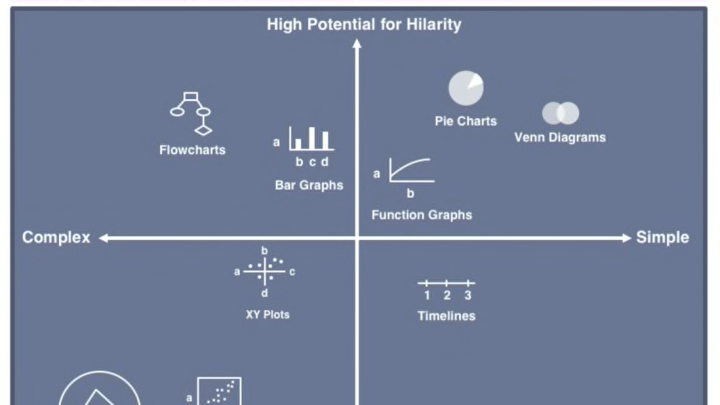
Can graphs be funny? That’s a silly question, as you’ve seen plenty of funny flowcharts, pie charts, and Venn diagrams, as well as other charts and graphs, made just for fun here already. But there are other kinds of charts that have a joke in them somewhere. Doghouse Diaries explains a graph's potential for humor. This type of chart is called an XY Plot, or scatter chart, which places items along two axes depending on the two variables measured in relationship to other items.

Randall Munroe of xkcd made a scatter plot comparing the tastiness of fruits with the difficulty of preparing and eating them. The comic has a NSFW title.

This graph sparked a bit of controversy, as both tastiness and difficulty are opinions, and inspired another graph from R. Stevens, a grapefruit lover.

The kind of graph that is the most familiar to most people is the line graph that plots the rise and fall of one variable over time. It’s easier to understand when the peaks and valleys are labeled accordingly. Here we see the highs and lows of being a young man.

One you may relate to this time of year is the vacation graph by Jorge Cham of PHD Comics. The stress that goes into arranging a vacation pretty much negates the stress relief you get from being on a vacation, and then you have to deal with all the problems that cropped up in your absence. Is it worth it? Yes, for the stories you’ll have to tell about it for the rest of your life.

Graphic artist Stephen Wildish creates clever posters and graphics of all kinds. One form he uses is the narrative graph, which plots stories, more than one at a time, in order to compare them. This one called Common Nanny Narratives has the three nanny stories we are most familiar with. They are obviously familiar with each other as well. Also see his Common Fairytale Narratives, three of them, and the Hamlet/Lion King graph.

Wildish also does Venn diagrams, mostly of food, but no subject is off-limits. Favorite foods are often made of three or four main flavor ingredients, and can be broken down into their components, like this diagram of sauces. See more of Wildish’s Venn diagrams here, and buy one at Red Bubble. See Wildish’s full range of graphics at his website.

A Gantt chart is a type of timeline, often used for projects, in which different elements each have their own timeline, but they are all coordinated. When I first read about them, I thought these would be perfect for explaining to my kids how to cook several dishes and get them to the dinner table at the same time. The Universal Gantt Chart for Project Managers shows how projects actually go, instead of how they are planned.

A simpler example is this Gantt chart by Bridget Finnegan detailing what interested her during childhood. You can see her baby brother was only interesting for a short time, while only mommy predated her interest in Barbie.

Timelines can be confusing in movies, and none as much as the time-travel film Primer. Although the movie covers only five days, there are nine timelines, according to this graph at Unreality magazine. Click the image at Unreality twice to enlarge it to readable size. While this is a serious attempt to make sense of the movie, it is way more trouble than it’s worth even to read it. I can imagine the torture that went into constructing it.

Still, it’s an improvement over the Primer timeline from Randall Munroe at xkcd, a small part of a comic that has several movie timelines. The others are pretty straightforward.

Then there are pie charts. You’d think that pie charts would be so easy to understand, but there’s always someone who doesn’t get it. See more pie charts in a previous list.

If you don’t like any charts at all, may I suggest the Grapathy Shirt, for those who are sick of graphs.
