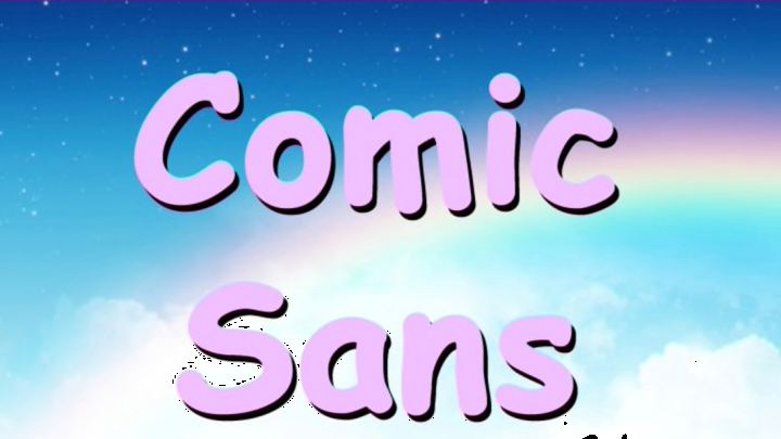
When Vincent Connare designed Comic Sans for Microsoft, he couldn’t have known how controversial his font would become. Initially a favorite when it was released in 1994, it has since become a subject of scorn among designers and Internet users alike. People really, really love to hate Comic Sans. “Like the tone of a spoken voice, the characteristics of a typeface convey meaning. … Clearly, Comic Sans as a voice conveys silliness, childish naivete, irreverence,” reads Ban Comic Sans, just one of many websites devoted to getting rid of the font. “By banding together to eradicate this font from the face of the earth we strive to ensure that future generations will be liberated from this epidemic and never suffer this scourge that is the plague of our time.” But the font has its defenders, too. Here, a compilation of Comic Sans disses ... and tributes.
1. TRIBUTE: Comic Sans Day
Since 2009, Dutch radio DJs have celebrated Comic Sans Day on the first Friday in July, encouraging listeners to “send all your mails, print all your reports and all your sticker address labels in this illustrious font.” In 2013, even Dutch airline KLM got in on the fun, changing the font on their website to Comic Sans and giving people named C. Sans the opportunity to win plane tickets.
2. DISS: Skype’s Judging Frown
Change your font to Comic Sans in Skype messenger, and the emoticon next to the text field changes to a frowny face. Change it to any other other font, though, and the smiley face returns.
3. TRIBUTE: CERN’s Higg Boson Announcement
In July 2012, CERN spokeswoman Fabiola Gianotti used Comic Sans in the presentation that announced the discovery of the Higgs Boson—and controversy exploded over the internet. But Gianotti didn’t get the fuss. She used it, she told Symmetry magazine, “Because I like it. It's so cute. I find it a sweet and pleasant font. I was amazed [by the reaction]. It made such a big splash. I learned that a person in the UK is running a campaign to rename Comic Sans to Comic CERN.” (Connare is on board with the idea.)
4. DISS: CERN’s Comic Sans April Fools
In 2014, CERN poked fun at the Comic Sans controversy by announcing that all of its webpages would be written in Comic Sans. “The change of font is the first in a series of proposals ratified by management to update CERN's image, including suggestions such as adding a selfie of Justin Bieber to the CERN logo and rebuilding the LHC in the shape of a triangle,” the press release noted. “CERN management also decreed that especially important physics results would from now on be accompanied online by animations of little clappy hands.”
In 2011, Google also made Comic Sans the butt of its April Fools Day joke: Users who googled Helvetica got search results entirely in Comic Sans, and if they googled Comic Sans, they got search results in … Comic Sans.
5. TRIBUTE: Princeton Study
Although students in a 2004 study called Comic Sans “too childish,” a 2010 Princeton study found that if students studied material in harder-to-read fonts—including Comic Sans—they retained more and did better when tested.
6. DISS: Kill Comic Sans Game
In this game, you can "do the world a favor" by shooting at Comic Sans.
7. DISS: Comic Sans Must Die
This tumblr is described as “a project that satisfies every designer's dream: to see Comic Sans die a slow and painful death. Every day the individual glyphs of Comic Sans will have their demise displayed for all to see.”
8. TRIBUTE: The Comic Sans Song
“How can you hate a font that’s so fantastic?” asks Andrew Gunadie, a.k.a. Gunnarolla, before following up with a kinda-sorta-maybe burn: “Comic Sans is the best font in the world / If you want your designs to look like they’re done by little girls / Comic Sans, best used in moderation.”
9. DISS: Comic Sans Criminal
This site walks so-called offenders through the reasons why this font is just so awful, then asks them to take a pledge that the person will “seriously consider whether Comic Sans is an appropriate font choice before using it in any printed work in the future.” End your experience by letting other Comic Sans criminals know the error of their ways.
10. TRIBUTE: In Defense of Comic Sans, VSauce
Host Mark Stevens outlines why we hate Comic Sans, and why we probably shouldn’t hate it so much, in this video. It was “a pragmatic font, a font that worked remarkably well in its era, and exists today as one of the most recognizable relics of one of the most important design revolutions in history,” he reasons. “Sure, Comic Sans is a bit ugly, but it’s ugly in the same way that the first few chords of ‘Smoke on the Water’ are ugly, as played by almost every beginning guitarist. … Sure, it sounds annoying and a little bit fumbly, but it represents someone who is using tools to move toward mastery.” Stevens sums up: “Comic Sans, overused by the untrained majority, may seem unsavory to some people, but as such, it most loudly represents something phenomenal: Today, it is possible for the whole world of thought to be made legible and be shared by the whole world.”
11. DISS: Orange is the New Black (Spoilers for the second season!)
In the seventh episode of the Netflix show's second season, protagonist Piper Chapman and a few other inmates are tasked with starting a newsletter. "Are you sure about this font?" one inmate asks Daya. "Just because it's a comic doesn't mean you have to use Comic Sans!"
"Hater!" Daya replies.
BONUS: McSweeney’s “I’m Comic Sans, A**hole”
This humor piece, a transcript of Comic Sans’ imagined inner monologue, is hilarious.
