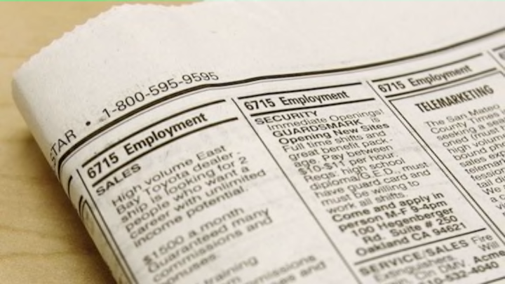
Your dream job just became available. You know you’ve got the education, the experience, the know-how, and the passion to fill the position better than anyone else could. Heck, your grandfather even founded the company. But you sent your resume off a full month ago and have yet to hear a peep of confirmation that you are indeed the one and only person for the gig. The problem? It could very well be your penchant for Times New Roman.
“A résumé, that piece of paper designed to reflect your best self, is one of the places where people still tend to use typeface to express themselves,” writes Bloomberg Business reporter Natalie Kitroeff in “The Best and Worst Fonts to Use on Your Résumé.” So she and her team recruited “three typography wonks” to weigh in on what one’s choice of font says about his or her personality.
Among the article’s most surprising findings is that there’s an ongoing debate regarding the professional appropriateness of the seemingly innocuous (and often default) Times New Roman font. While Berlin-based designer Martina Flor has no personal beef with the font, she understands why people see it as a statement in dullness, but attributes some of that to the fact that it has been around forever. “It has been a system font for a long time,” Flor says. “It’s been used and misused a lot.”
Brian Hoff, creative director of Brian Hoff Design, sees it a bit differently: “It’s telegraphing that you didn’t put any thought into the typeface that you selected,” he says. “It’s like putting on sweatpants.” (For the record: Wearing sweatpants to an interview is also frowned upon.)
Of all the fonts discussed, there was only one that all three designers could agree on: good ol’ Helvetica. “Helvetica is so no-fuss, it doesn’t really lean in one direction or another,” states Hoff in the article. “It feels professional, lighthearted, honest. Helvetica is safe. Maybe that’s why it’s more business-y.”
“If it's me, [I’m using] Helvetica,” adds Matt Luckhurst, creative director at Collins. “Helvetica is beautiful. There is only one Helvetica.”
For job seekers with a longer resume, Luckhurst recommends Garamond. “Garamond is legible and easy for the eye to follow,” he explains. “[It] has all these quirks in it, so what that does is allow the eye to see where it should go.”
“You don’t have a typewriter, so don’t try to pretend that you have a typewriter,” says Luckhurst of what may be the oldest school font of them all: Courier. “You have been using a computer to do a handwritten thing. You haven’t used a computer properly, and you haven’t handwritten properly.”
The only other font that all three experts agreed on was the one font you never want to use, “unless you are applying to clown college,” jokes Hoff: Comic Sans.
We might be willing to wager that even a few clown colleges would be offended by such a hokey, wannabe-whimsical choice in typography.
