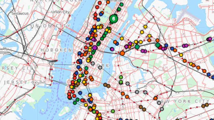
For anyone who’s ever wondered where the heck the train is, there’s now an easy way to find out.
TRAVIC, or Transit Visualization Client, is a moving data map of NYC subways manifested as color-coded dots. The ever-shifting circles show you the big wide world of mass transportation as it’s happening, or rather, as it's supposed to be happening. The data is pulled from transit operators and agencies, mostly from schedules, though real-time stats are incorporated when possible. It was created by GeOps and data scientists at Germany’s University of Freiburg.
New York is just one of 249 locations covered by TRAVIC. You can watch transit happening around the world, from São Paulo to Tel Aviv. So even if it can’t necessarily help you locate the specific 7 train that was supposed to arrive 10 minutes ago, a peek at the mesmerizing visualization could be a good exercise in finding the beauty (and zen) in public transportation.
