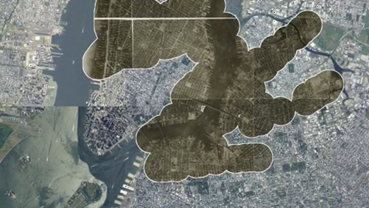
Cities never look the same for more than a few years in a row. Landmarks disappear, elevated trains give way to streetcars and subways, and old industrial sites get rehabbed, to name a few common changes. Over the past century, a fair amount has changed in New York City, as evidenced by a new application that compares the modern city to its 1924 past.
Urbanist and data visualization enthusiast Chris Whong created Urban Scratch Off, a simple site with two layers of maps—one from 1924 and one from today—that allows users to erase one layer to reveal the imagery beneath. While much of the city’s broad design looks quite similar in structure to its 1924 incarnation, some infrastructure projects have made big impacts.
Whong’s original concept was to visualize the impact the Brooklyn-Queens Expressway had on the communities in its path, and the level of demolition that occurred to make way for the highway. But once you start scratching off parts of the city to reveal the historical urban fabric, it’s hard to stop at just the path of one highway. So he made it into a city-wide visual of urban development over 90 years.
Since 1924, waterfronts have changed (Battery Park City, a landfill site in downtown Manhattan, was completed in 1976), stadiums have moved (the current Yankee Stadium is a block north of the original, and the original home of the Brooklyn Dodgers is now an apartment building), and major airports have been erected (JFK opened as New York International Airport in 1948). Just draw your mouse over a location to see what it looked like before versus what it looks like now.
Whong hopes to add points of interest in the future, because without a search function, it’s a little hard to find specific places unless you’re super familiar with the geography. Play with it for yourself here. It’s like a virtual lottery scratcher, except you don’t lose any money.
[h/t: CityLab]
