You don’t need a single word of copy to know that the Apple logo is indicative of the famous hardware company founded by Steve Jobs, or that the Golden Arches promise a very particular fast-food dining experience. Occasionally, that kind of silent recognition is present in feature films, where graphic designers have created iconic logos for movies that become synonymous with their titles. Take a look at the stories behind six of Hollywood’s most indelible movie trademarks.
1. GHOSTBUSTERS (1984)
Amazon
Appearing prominently on posters for three theatrical Ghostbusters films, the stylized, seemingly spooked ghost was actually designed before the 1984 original even had an official title. Designer Michael C. Gross had previously worked in print media before meeting director Ivan Reitman, who invited him to craft an image for his in-development paranormal comedy. The problem, Reitman explained, was that the studio hasn’t yet cleared Ghostbusters from Filmation, which had produced a 1975 kid series called The Ghost Busters—until the legal matter was resolved, the teaser poster would have to stand on its own. Gross took the description of the ghost logo from Dan Aykroyd’s script, which called for it to appear on the team’s car and uniforms, and drafted 30 or so variations before settling on the affable specter with a banned strike running through it.
Everyone loved it. Mostly. Harvey Comics, which published Casper the Friendly Ghost, believed Gross’s sprite looked too much like a supporting Casper character named Fatso and sued Columbia Pictures over it. The two parties settled. Gross was unmoved by the charge. “There are only so many ways you can draw a cartoon ghost,” he said.
2. JACKASS: THE MOVIE (2002)
Amazon
Originally seen in the 2000-2002 MTV series, the skull-and-crutches has come to represent the anarchic spirit of Johnny Knoxville and his troupe of stunt comedians. Director Jeff Tremaine had graphic designer and friend Andy Jenkins compose the logo: The two knew each other from the BMX and skateboarding scene of 1980s California.
Oddly, the logo has come to take on an entirely different meaning for the Mexican drug cartel. In 2009, three suspected assassins in Tijuana were detained after authorities noticed bullet holes along the side of their vehicle. Inside were 15 black uniforms adorned with the logo. In 2012, the San Diego Reader reported that the emblem was favored by notorious drug dealer Raydel “El Muletas” Lopez Uriarte to identity his drug shipments and employees.
3. BATMAN (1989)
Amazon
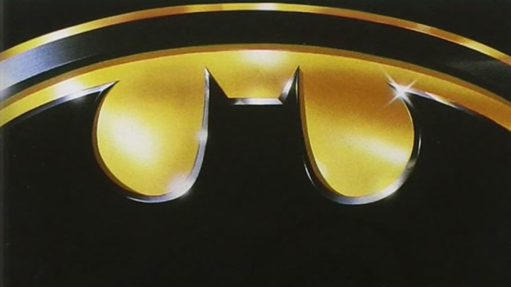
The comic book movie industry had not yet taken shape when Warner Bros. and director Tim Burton mounted their serious take on the Dark Knight: The last major live-action adaptation of the character had been the campy 1966 ABC series starring Adam West. To help distance themselves from that take, and to capitalize on the recognition Batman had with a mainstream audience, producer Jon Peters decided to enlist the film’s production designer, Anton Furst, to rethink the Bat-logo for teaser posters. Peters, Furst recalled, hated the early posters that looked like generic action movie ads and wanted Furst to “drop everything” else he was doing on the movie to revisit the logo.
Rather than use the bright yellow background of the emblem from the comics, Furst and ad agency B.D. Fox went with a stark gold with clean, sharp lines that was both familiar and different enough to make people walking by the poster do a double take. (Seen in silhouette, the Batwing vehicle in the film mimicked its shape.) The slightly abstract imagery was so successful that it was used throughout the film’s numerous merchandising lines and was reimagined in a snow drift for the 1992 sequel.
4. THE JAMES BOND SERIES (1962-PRESENT)
Amazon
Guns, gadgets, women: The 007 logo for the James Bond series makes promises to viewers with three simple numbers. Iconic now, it was originally intended to be used for nothing more than letterhead. Designer Joseph Caroff was commissioned by United Artists to create a Bond image the studio could use to help identify press releases for media members. Caroff decided to use Bond’s agent classification. In drawing it, he realized the “7” could be a piece of a gun and added an outline of a Beretta firearm that he had come across during a visit to the library. Caroff received $300 for the work.
5. THE SILENCE OF THE LAMBS (1991)
Amazon
There are multiple dimensions to the theatrical release poster design that helped moviegoers spot this Oscar-winning adaptation of author Thomas Harris’s novel about FBI agent Clarice Starling’s peculiar relationship with unofficial mentor—and serial killer—Hannibal Lecter. The moth depicted in the artwork is real: The death’s head, or doomsday, hawk moth is native to Europe and has what looks to be a skull on its back. But if you look extremely closely, you’ll see that the skull is actually paying homage to Salvador Dalí’s “In Voluptas Mors,” a 1951 photograph depicting seven naked women intertwined.
6. JURASSIC PARK (1993)
Amazon
The silhouette of a T. rex skeleton frozen in time while stalking its prey was courtesy of book jacket designer Chip Kidd, then an assistant for book publisher Alfred A. Knopf. Kidd's design for the original printing of Michael Crichton’s 1990 novel was later placed against a red backdrop and used in promotional materials for the 1993 film adaptation. Kidd said he went to the Museum of Natural History, found a book in the gift shop that featured a T. rex skeleton diagram, reconstituted it for accuracy, and then watched it become synonymous with both the film franchise and dinosaurs as a whole for the next quarter-century.
Kidd recalled that Universal’s marketing department called Knopf requesting permission for his image in case they “might” want to use it for the film’s advertising. Tom Martin, the film’s poster designer, used Kidd’s design, adding typeface and a small jungle landscape at the bottom to help give the dinosaur scale. For the sequel novel, The Lost World, Kidd simply turned the T. rex's face downward.
