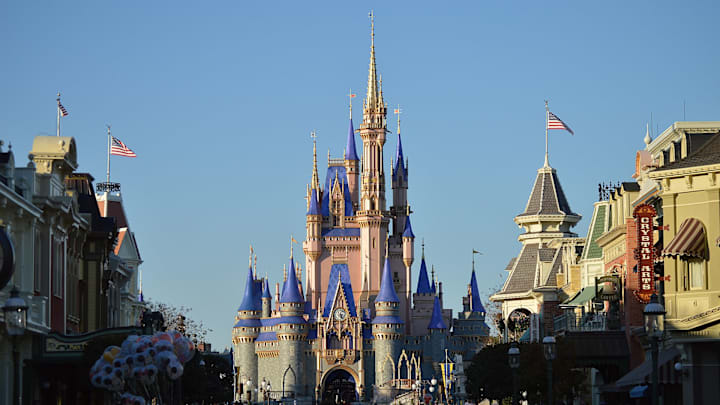
Walt Disney World has earned the nickname “most magical place on Earth” for many reasons. You can see your favorite characters come to life, enjoy rides, eat Disney-themed foods, and more. But a large part of the magic goes unnoticed. Part of the reason why you can easily get lost in the park’s world is thanks to two proprietary paint colors: Go Away Green and Blending Blue.
Go Away Green: The Color You’re Not Meant to See

If you’ve visited the parks, you’ve likely seen these hues without realizing it—and that’s the point. According to Real Simple, Disney Imagineers made Go Away Green and Blending Blue to camouflage different elements into the background. Designers can’t decorate every single part of the parks; some aspects are too big and would distract from the immersive atmosphere. Construction walls are a common example, and these shades help make them unnoticeable.
Go Away Green was designed primarily to blend buildings into the park’s greenery. It’s also used on smaller items that shouldn’t stand out, such as cameras and trash cans. The color specifically consists of hues from a combination of plants in the area, as well as a shade of brown, gray, and another shade of green that the human eye naturally overlooks.
You May Also Like:
- Quiz: Only a True Disney Fan Knows Who Voiced These Disney Characters
- No Capes: 37 Things That Can Get You Banned From Disneyland
- 15 Most Popular Baby Names From Disney
Add Mental Floss as a preferred news source!
Go Away Green will sometimes come in different shades to better match the surrounding foliage. Disney hasn’t made the exact color commercially available, but according to Inside the Magic, close matches include Enchanted Evergreen from Rodda Paint and Whispering Willow from Glidden.
Blending Blue: Sky’s the Limit
Disney’s Florida theme park was built in a more remote location than the original Anaheim park, which meant builders had less construction limitations. Imagineers therefore had to get creative when blending the taller buildings into their surroundings—or the sky. That’s when Blending Blue was made. The workers couldn’t blend the towering buildings into greenery closer to the ground, so they found a color that matched the Florida sky year-round. Like Go Away Green, Disney hasn’t disclosed the exact hue; the closest shades include Soft Cloud by BEHR and Upward by Sherwin-Williams.
Next time you’re walking through a Disney Park, keep an eye out for these subtle shades in the background—or keep on ignoring them and let yourself get lost in the magical illusion.
