If you live near, say, California’s San Andreas Fault, you’re probably aware that there’s a high risk of earthquakes in your area. But even in places where seismic activity doesn’t often make the news, there’s still some level of risk.
CNN recently published an interactive map of the U.S. that helps define those levels. Basically, you enter a location in the search box and the map will tell you its risk level: lowest, very low, low, moderate, high, very high, and highest.
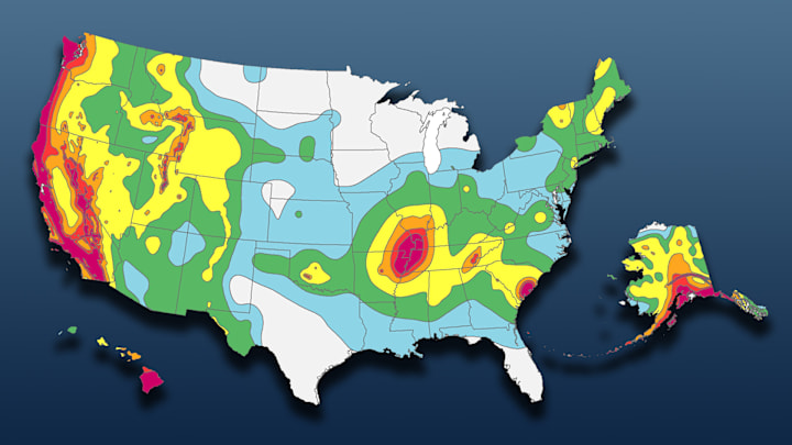
Those categories are all color-coded, from dark blue to light blue to yellow to orange to red, so a zoomed-out look at the map gives you a handy overview of all the hot spots (and cold spots) in the country. Unsurprisingly, the West Coast is nearly all red, from the southern tip of California to the northern tip of Washington.
Another highest-risk area is the New Madrid Seismic Zone, which covers parts of Tennessee, Kentucky, Illinois, Arkansas, and Missouri. Most of the East Coast boasts varying shades of blue, but there’s a sizable red patch around Charleston, South Carolina. And if you want to keep your chances of experiencing an earthquake as low as possible, you should move to North Dakota, Minnesota, or Michigan—or, for warmer weather, South Texas or South Florida.
To make the map, creators Byron Manley, Matt Stiles, and Renée Rigdon used a 2018 map from the U.S. Geological Survey that determined regional earthquake risk levels “based on seismicity and fault-slip rates” as well as “the frequency of earthquakes of various magnitudes.”
Explore the map—and find out what your city or town’s earthquake risk level is—here.
