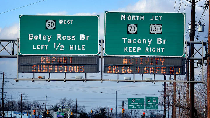
Every day on the road can offer fresh surprises, from traffic jams to undefined roadkill. But it may take you driving the same route over and over again before you notice that highway signs don’t use just one type of font—they use two. Wouldn’t it be more consistent (and easier) to stick to one?
According to Vox, the reason motorists see different fonts is because change was (briefly) underway. In the 1950s, signs in the emerging cross-country highway system were designed using what’s now known as Highway Gothic, a slightly shaky font that was standardized across states. It originated with the California Department of Transportation in 1948 and was quickly adopted elsewhere.
But as with most early attempts at novel infrastructure, Highway Gothic presented unforeseen problems. Its weakness as a travel typeface became apparent when reflective signs became commonplace. Intended to have better visibility at night, the signs solved one problem but created another. The reflected light blurred the Highway Gothic typeface, making some lowercase letters (like e, a, or s) hard to read. You might drive right past the exit for Monroe, for example, thinking it’s Monroo.
(To make matters slightly more complicated, there are different variations within Highway Gothic, as the font underwent sporadic tweaks over the years.)
Being subject to government red tape, this went on for a while. Then, in 2004, the Federal Highway Administration launched an initiative to transition the standard font to Clearview, which features more broadly defined letters that have wider spacing, making directions easier for travelers to read and reducing the blurring effect. Pennsylvania was the first state to make the switch; others followed.
But many found it hard to tell the difference, as evidenced by the comparison made by one Texas news affiliate below:
So how did we wind up with both? In 2016, the FHWA throttled back on the Clearview rollout after reports indicated there actually wasn’t much difference in legibility between the two fonts. In some cases, like on speed limit signs, the change might actually worsen visibility. Typeface infighting ensued, in which Clearview advocates argued the opposite—that the newer font was better. Ultimately, the FHWA told states they could use whichever font they liked.
The result? An interstate highway system that mixes the two fonts. Some states, like Kentucky, switched to Clearview entirely; others, like Ohio, upgraded some signs but not others. Drive long enough and you’re likely to spot both typefaces, which will probably be the case until the government decides neither one is good enough. Then you’ll be able to enjoy three.
