Keith Houston's new book Shady Characters: The Secret Life of Punctuation, Symbols, and Other Typographical Marks, is available for purchase at Amazon, Barnes & Noble, iBookstore, Indiebound, and Powell's.
The margins of books have always been a playground for their readers’ notes, doodles, and questions. From the Library of Alexandria to Europe’s medieval monasteries, here are five ancient symbols that helped readers make sense of their books.
1. Paragraphos
Ménandre: Sicyoniens; MP 3 1308.1. inv. 2272 e. Image courtesy of Jean Gascou of the Institut de Papyrologie, Paris Sorbonne.
An ancient Greek of Homer’s time would have had their work cut out when it came to reading. Documents were written so that their text flowed from left to right and back again, like a farmer plowing a field, with no spaces between words, capital letters, or punctuation to help them find their way. The one glimmer in the darkness was provided by the paragraphos, a simple horizontal stroke drawn beside or just under a line of text. A paragraphos (from para-, “beside,” and graphein, “to write”) told the reader that there was something of interest in the associated text, though not what that thing was: It could be a change in speaker in a play, a new chapter, or anything else besides, and it was up to the reader to decipher its meaning.
2. Diple
Diples, an obelos, and paragraphoi in a reproduction of Homer. (“Book 12.” In Homeri Ilias Cum Scholiis. Codex Venetus A, Marcianus 454 Phototypice Editus, 161v. Lugduni Batavorum: A. W. Sijthoff, 1901.) Courtesy of Stoa.org.
Punctuation, from the Latin punctus, or “point,” first appeared at the library of Alexandria in Egypt during the third century BC. While the paragraphos was for writers, points were for readers: Texts were often read aloud, and readers would mark up their works with points placed at different heights (·, ., and ˙) to indicate pauses of increasing duration. Only a generation later, editors and copyeditors too were granted their own dedicated marks, beginning with the diple, or “double” (>, ⸖, or ·>). Made popular by Aristarchus, a scholar editing Homer’s epic poetry, the diple was like the paragraphos in that it was used to highlight a line containing some interesting feature. But where the paragraphos evolved into the pilcrow (¶), or paragraph mark, the diple instead gave rise to the inverted commas (“ ”) used to surround words quoted from other texts.
3. Asterisk
A bevy of asterisks in a reproduction of Homer. (“Book 1.” In Homeri Ilias Cum Scholiis. Codex Venetus A, Marcianus 454 Phototypice Editus, 33r. Lugduni Batavorum: A. W. Sijthoff, 1901.) Courtesy of Stoa.org.
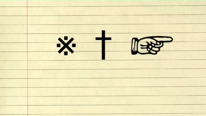
Aristarchus, the ancient Greek scholar who popularized the diple, is famous for the palette of “Aristarchean” marks with which he edited texts: the diple, the asteriskos, and the obelos. The asteriskos, or “little star,” was placed alongside lines that had been mistakenly duplicated; mistakes were numerous because texts were copied by hand, and Homer’s ancient poetry was riddled with errors. The asteriskos (※), of course, became the modern asterisk (*), which can still be found in the margin (albeit at the bottom of the page) where it acts as a footnote reference. Nowadays the asterisk is often applied to the names of athletes or celebrities who have been somehow embarrassed or discredited, implying that their achievements come with an accusing footnote. Lance Armstrong, who doped his way to seven Tours de France, and George W. Bush, whose 2000 election victory was won in the courts, have both been criticized by journalists wielding asterisks.
4. Dagger
Daggers and double daggers, or dieses. Top row, left to right: Linotype Didot, Big Caslon (Carter & Cone Type), Hoefler Text (Apple), and Zapfino (Linotype); bottom row, left to right: Helvetica (Linotype), Skia (Apple), Courier New (Microsoft), and Museo Slab (Jos Buivenga). Image by the author.
The obelos, or “roasting spit,” was the third and last of Aristarchus’s marks. The dash-like obelos (—, though it was sometime decorated with a pair of dots to give ÷) was placed alongside lines to be deleted, with one seventh century writer explaining that “like an arrow, [the obelos] slays the superfluous and pierces the false.” Over the centuries the obelos morphed into the dagger (†), which has maintained its partnership with the asterisk through thick and thin. Both symbols are used to link footnotes to the main body of text, though in some European countries they have an extra meaning, telling readers when someone was born—“Herman Melville (*1819)”—or when they died—“(†1891).” The dagger is often now confused with the Christian cross, and many fonts include daggers that are simply crosses by another name.
5. Manicule
A very pious manicule drawn in the margin of an early printed book. Image courtesy of the Penn Provenance Project.
As writers started to borrow the punctuation and other marks (like the diple) that readers and editors had once used, readers found themselves without a standard way to highlight interesting text. Towards the end of the medieval period, when a new wave of secular scholarship swept across Europe, a new mark appeared that let readers do just that. The manicule, index, or pointing hand (☞) cropped up in the margins of Renaissance manuscripts wherever readers found a sentence or paragraph they wished to highlight for future reference. Some of these pointing hands were little more than bookmarks, while others came with voluminous sleeves on which their creators added their thoughts on the text. Manicules were not just for stuffy, academic notes, either: Instead of pointing hands, some readers chose to annotate their books with spidery octopuses or even little pointing penises.
