If you love design and you love words, chances are you get excited about a well-designed font. Here are a handful of terms to get you started as a font nerd.
1. Glyph
![](https://images2.minutemediacdn.com/image/upload/c_fill,w_16,ar_16:9,f_auto,q_auto,g_auto/shape/cover/sport/brokenimagev3-db8c80b48cdc692877c4bea30db81f82.png)
Thinkstock
A glyph is a written symbol that carries meaning. For example, letters are glyphs.
2. Kerning
![](https://images2.minutemediacdn.com/image/upload/c_fill,w_16,ar_16:9,f_auto,q_auto,g_auto/shape/cover/sport/brokenimagev3-c21a02ced627e0dfbf0fa2515093f21f.png)
Kerning is the careful calibration of space between pairs of letters to create a balanced and visually pleasing effect.
3. Sans serif
![](https://images2.minutemediacdn.com/image/upload/c_fill,w_16,ar_16:9,f_auto,q_auto,g_auto/shape/cover/sport/brokenimagev3-a49cfa66406f789a115cfa8e1455a441.png)
Serifs are the little lines at the ends of the strokes in some letters. Sans means “without,” so a sans serif font has no serifs.
4. Bowl
![](https://images2.minutemediacdn.com/image/upload/c_fill,w_16,ar_16:9,f_auto,q_auto,g_auto/shape/cover/sport/brokenimagev3-13e66eaf737b4371863f7485b0f7a97c.png)
Thinkstock/Erin McCarthy
The bowl is the curved part of a letter that encloses an open space, as in the letters o, p, d, b and q.
5. Swash
![](https://images2.minutemediacdn.com/image/upload/c_fill,w_16,ar_16:9,f_auto,q_auto,g_auto/shape/cover/sport/brokenimagev3-f7a7dde3b4acacd895218a7279176b49.png)
A swash is an embellishment or flourish on a glyph.
6. Halbfett
![](https://images2.minutemediacdn.com/image/upload/c_fill,w_16,ar_16:9,f_auto,q_auto,g_auto/shape/cover/sport/brokenimagev3-a2a5e298133aecbb3e2556ea3cd0c02b.png)
This German word is commonly used for the bold weight in a type family.
7. Point
![](https://images2.minutemediacdn.com/image/upload/c_fill,w_16,ar_16:9,f_auto,q_auto,g_auto/shape/cover/sport/brokenimagev3-c117aa6fa38c04e4e6da7f4238927919.png)
The point is a unit of measurement used to define font size. In the digital age, there are 72 points per inch.
8. Ascenders
![](https://images2.minutemediacdn.com/image/upload/c_fill,w_16,ar_16:9,f_auto,q_auto,g_auto/shape/cover/sport/brokenimagev3-27690ca862146b64dc181dbea2ef4094.png)
These are the tall parts of letters such as lowercase d, l and f, which ascend above the typical height of a lowercase x.
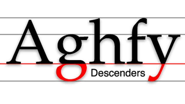
9. Descenders
![](https://images2.minutemediacdn.com/image/upload/c_fill,w_16,ar_16:9,f_auto,q_auto,g_auto/shape/cover/sport/brokenimagev3-2d8913751277ea929c7b9b3383bd2604.png)
Similar to ascenders, except they drop below the baseline, or the bottom of a line of lowercase text. Lowercase j, p, g and q have descenders.
10. Diacritics
![](https://images2.minutemediacdn.com/image/upload/c_fill,w_16,ar_16:9,f_auto,q_auto,g_auto/shape/cover/sport/brokenimagev3-f71ea485f041703461dfffa081432d56.png)
Diacritics are extra marks added to a letter that changes the sound of the letter, or add an additional sound or meaning to the word. Examples include accent marks, tildes, and umlauts.
11. Handgloves
![](https://images2.minutemediacdn.com/image/upload/c_fill,w_16,ar_16:9,f_auto,q_auto,g_auto/shape/cover/sport/brokenimagev3-26fc836c0539959e620cc6781b11047f.png)
Many font designers use the word “handgloves” to show off their work because the combination of letters represents most of the strokes and shapes found in the font.
Sources: Font Shop Typographer’s Glossary and Wikipedia.org.