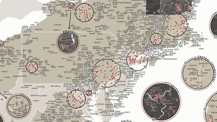
America is the land of the free and home of the beer—er, brave. We meant brave. With over 5000 breweries, microbreweries, and brewpubs scattered across the country, it’s easy to see how the U.S. earned the distinction of being the world's largest producer of craft beer. Using data from the Brewers Association, Pop Chart Lab paid homage to the nation’s domestic craft production by charting just about every brewery from sea to shining sea.

Their research team also consulted the “r/beer” Reddit thread and Googled phrases like “new breweries in Chicago” and “closed breweries in Seattle” to ensure their information was up-to-date. The result: A “mega-sized” map with dots representing each brewery.
To make the information easier to digest, the chart is color-coded by the number of breweries per 100,000 people; the darkest sections have at least six breweries per 100,000 people, while the lightest areas have zero to 0.5 breweries. Zoom in on the East Coast and you'll notice that tiny Vermont is especially dense. In fact, in 2016 the Brewers Association named it the state with the most breweries per capita. The map is quite detailed, but click the corresponding links and you'll be able to zoom in on the Midwest and West Coast.
The 48-inch by 32-inch “Breweries of the United States” print costs $65 and is now available for pre-order online (shipping begins October 19). To place your order or see a larger version of the print in its entirety, check out Pop Chart Lab’s website.
